
Steam capsule sizes and where they appear
A practical reference for the five artwork placements available in Steam Capsule Preview. Use the exact dimensions, then judge the artwork at the size and in the interface where players will encounter it.
Dimensions at a glance
Create each asset at its required dimensions. An image with the right ratio but the wrong pixel size can still be softened or rejected later in the publishing workflow.
| Asset | Dimensions | Ratio | Typical placement |
|---|---|---|---|
| Header capsule | 920 × 430 | 2.14:1 | Game page and recommendations |
| Main capsule | 1232 × 706 | 1.75:1 | Featured store carousel |
| Small capsule | 462 × 174 | 2.66:1 | Search, lists, and top sellers |
| Vertical capsule | 748 × 896 | 5:6 | Seasonal sale grids |
| Library capsule | 600 × 900 | 2:3 | Library overview and collections |
One game, five different crops
These Cyberpunk 2077 assets show how much the usable composition changes between Steam placements. Each example keeps its capsule's real aspect ratio.
Header capsule
Keep the game identity clear beside store-page copy. Avoid putting essential text against either extreme edge.
Check this artwork in the preview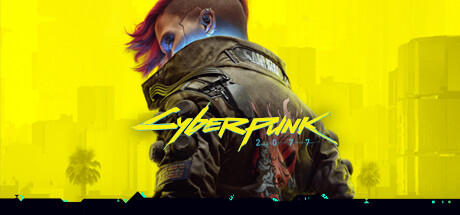
- Size
- 920 × 430px
- Aspect ratio
- 2.14:1
- Shown in
- Game page
Main capsule
Treat this as a cinematic feature image. The subject, logo, and background need to remain readable beside carousel information.
Check this artwork in the preview
- Size
- 1232 × 706px
- Aspect ratio
- 1.75:1
- Shown in
- Store home
Small capsule
This is the fastest legibility test. Fine detail and small taglines often disappear once the image is shown in a list.
Check this artwork in the preview
- Size
- 462 × 174px
- Aspect ratio
- 2.66:1
- Shown in
- Search results
Vertical capsule
Use the extra height for a strong subject-and-logo hierarchy. Do not stretch a landscape composition into the portrait crop.
Check this artwork in the preview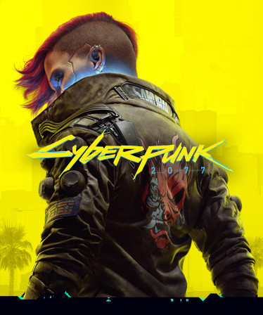
- Size
- 748 × 896px
- Aspect ratio
- 5:6
- Shown in
- Sale page
Library capsule
Design this as a durable cover rather than a store banner. It should still identify the game when displayed in a dense shelf.
Check this artwork in the preview
- Size
- 600 × 900px
- Aspect ratio
- 2:3
- Shown in
- Library
Good vs. weak header capsule
Both examples are shown at the same 460 × 215 size. Compare how contrast, focal point, hierarchy, and edge spacing affect the first impression.
Good example
Readable at a glance- Clear focal pointOne character dominates the frame.
- Strong contrastYellow separates the dark silhouette instantly.
- Clear hierarchyCharacter first, game identity second.
- Controlled edgesKey details have room around the crop.
Weak example
Header capsule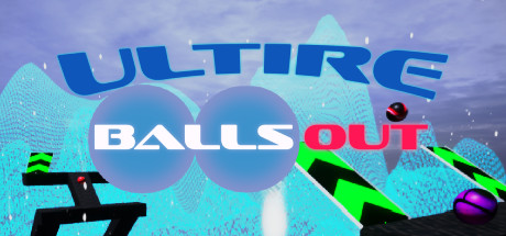
- Unclear focal pointText, circles, figures, and weapons all compete.
- Weak hierarchyBoth title lines demand equal attention.
- Poor contrastWhite and cyan merge into the pale background.
- Crowded edgesThe top title and weapons press into the crop.
Safe areas and readable artwork
Steam does not provide one universal safe-area rectangle for every capsule. Treat the outer edges as vulnerable and preview the actual placement before approving a crop.
- Keep the logo and main subject comfortably inside the frame.
- Judge the image at rendered size, not only in the source file.
- Use contrast and silhouette before adding more text.
- Check every crop independently; do not rely on automatic scaling.
JPG, PNG, and WebP
Steam Capsule Preview accepts JPG, PNG, and WebP files up to 15 MB. Use PNG when sharp logos or graphic edges are the priority, and a high-quality JPG for painted or photographic artwork when file size matters.
WebP is useful for testing in this tool. Before publishing, export the final asset in a format accepted by the current Steamworks upload workflow rather than assuming the preview format is a submission format.
Common capsule mistakes
Most weak capsules are not missing polish. They are missing hierarchy at the size where the artwork is actually displayed.
- 01Reusing one composition for every aspect ratio instead of making deliberate crops.
- 02Relying on a subtitle or small line of copy to explain what the game is.
- 03Placing the logo, face, or main subject too close to the outer edge.
- 04Checking artwork only at full resolution instead of at its rendered store size.
- 05Using similar brightness and color across the subject, logo, and background.
- 06Exporting an approximate ratio and allowing the final upload to be rescaled.
See the dimensions in context.
Upload your artwork and switch between all five placements.